Thank you for all the input. I'll be editing it later, and when I get through all the covers I'll put them in one post for everyone to enjoy. I'm glad for your opinions because I'm new to picture editing and I know some of you work well with photoshop.
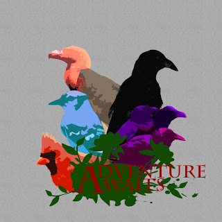
Anyway...here is Adventure Awaits.
I decided not to add the band name on this one. I felt like it cluttered it. So yeah. Like this one better? I still feel like there's something miss though. I just can't put my finger on it...any ideas?
This comment has been removed by the author.
ReplyDeleteI like it, but I feel is if there's too much negative space, especially on top. Great work though :)
ReplyDeletelooks great
ReplyDeletelooks awesome!
ReplyDeleteHow to Hack Life.
GG. Looking secksii.
ReplyDeleteThe red "Adventure awaits" text on the green background clashes a lot, have you tried other colours to make it stand out more?
ReplyDeleteWow beautiful artwork!
ReplyDeleteLove it, really nice.
ReplyDeleteGood stuff mate
ReplyDeleteits pretty good man, i like the simplistic approach!
ReplyDeleteSUPER illustration !!!
ReplyDeleteGood job, I like colors.
ReplyDeletenice cover man, cool stuff
ReplyDeletei feel like something can go in the gray like black branches or paint dots and smears, but looks real good
ReplyDeleteLooks great. I'm a fan of the range of colors used.
ReplyDelete